Vrinda Gupta
{Brand strategy, design research, visual design, website design, copywriting}
Abhishek Durani
{Creative direction, Brand strategy}
Anshul Gupta
{Visual design, Logo design & animation}
Devargh Mukherjee
{Verbal strategy, Copywriting}
Tanmay & Afeef
{Illustration}
Kashish Choudhary
{Copywriting}
Abhiroop Roy
{Product design}
Studio Muki & Akash
{Website development}
Karthik Venugopal
{Website/UX Design}
Rizul Tomar
{Animation}
Year: 2024
In a category where health is mistrusted and taste is a non-negotiable...
How do you make a staple brand that people adopt into their everyday diet?
In a category where health is mistrusted and taste is a non-negotiable...
How do you make a staple brand that people adopt into their everyday diet?
In a category where health is mistrusted and taste is a non-negotiable...
How do you make a staple brand that people adopt into their everyday diet?
In a category where health is mistrusted and taste is a non-negotiable...
How do you make a staple brand that people adopt into their everyday diet?

In a category where health is mistrusted and taste is a non-negotiable...
How do you make a staple brand that people adopt into their everyday diet?
In a category where health is mistrusted and taste is a non-negotiable...
How do you make a staple brand that people adopt into their everyday diet?


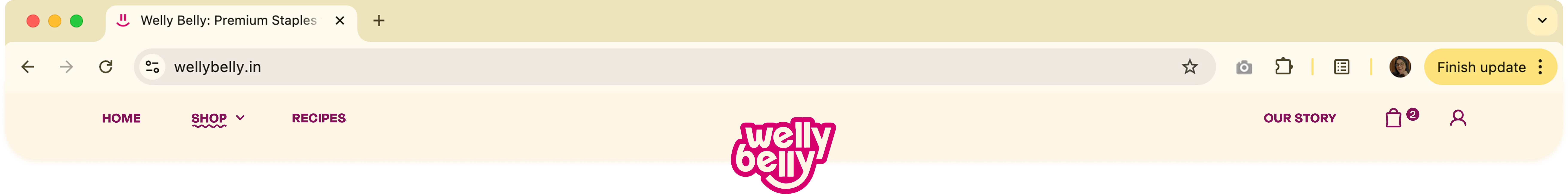
[ View full case study on web ]
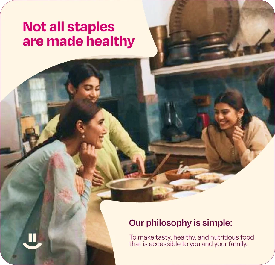
Welly Belly is a brand that makes staples with a focus on modern problems and lifestyles. With most food brands busy solving occasional indulgences, cheat meals, supplement and detox. The everyday went largely unquestioned.
The challenge
Building a brand that could earn a place in Indian kitchens that majorly depend on locally available staples. Making it as much about the cultural behaviour as it was about health and nutrition.
What’s the industry up to?

[1] Rising mistrust of claims on packaging. “Healthy” has become a buzzword.
[2] Demand for food that is clean and functional, all without compromise on taste.
[3] New-age brands making health fun and accessible instead of intimidating.
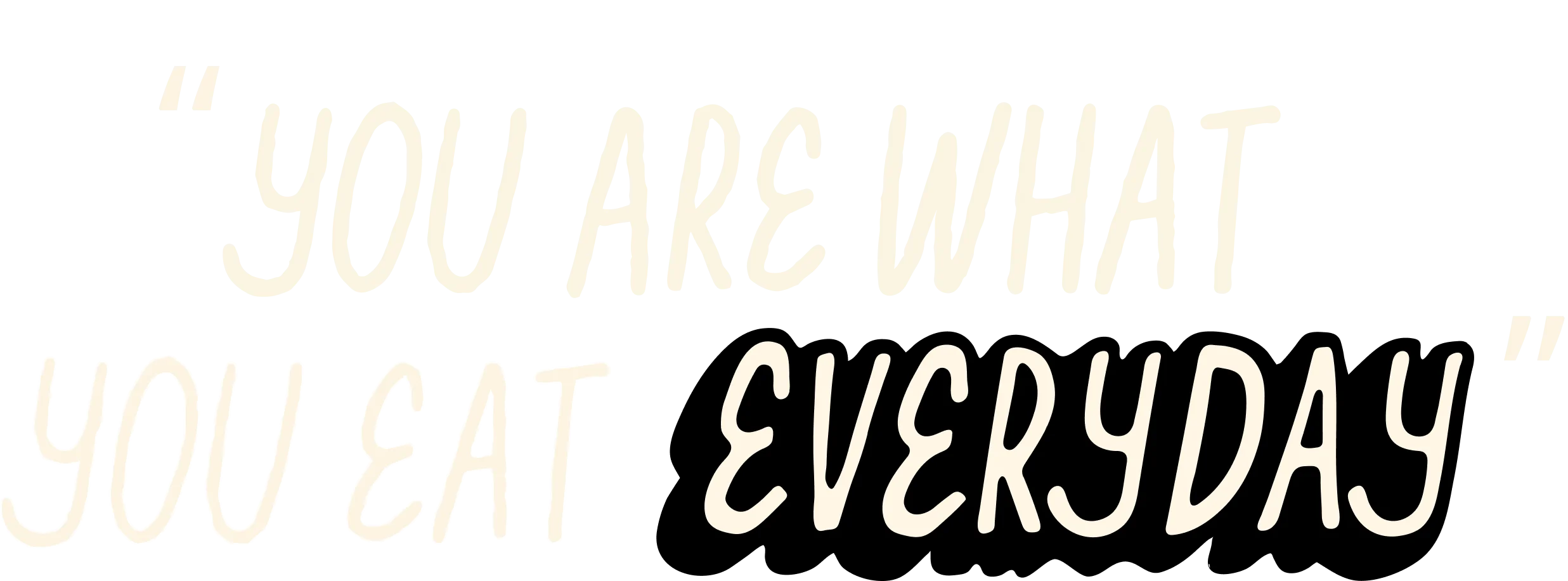
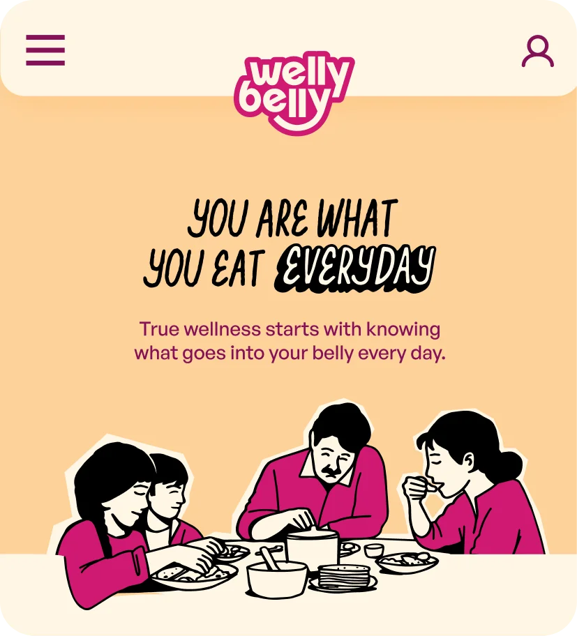
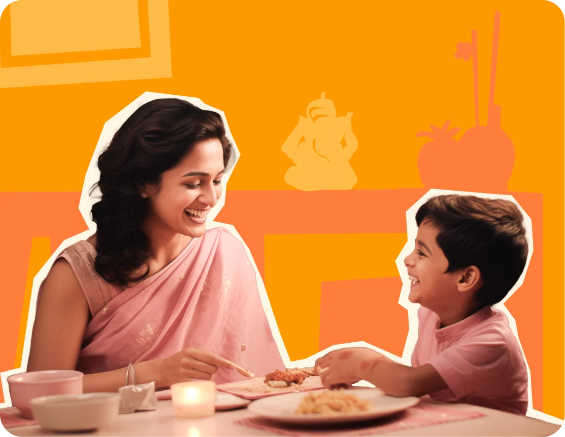
Because life is built on everyday moments, and every meal is a chance to make them count.
The strategy was to stop fighting the "healthy vs. tasty" binary, and anchor it in something that didn't require a trade-off.
Everything connecting back to how people eat, cook, and share food every day.
Everything connecting back to how people eat, cook, and share food every day.

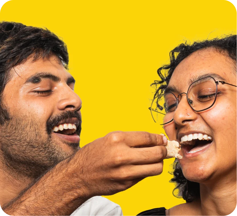
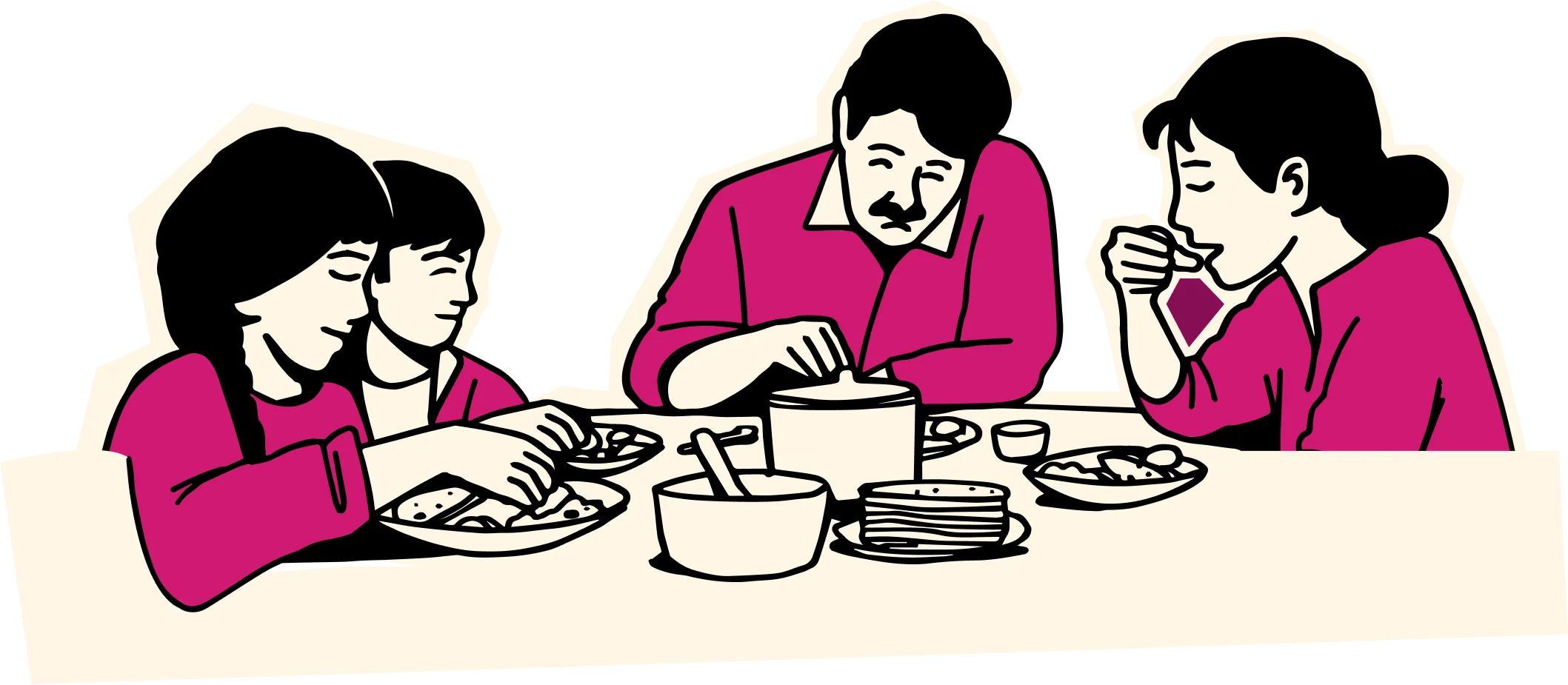
For Indians, cooking is a love language
and feeding is how we express it.
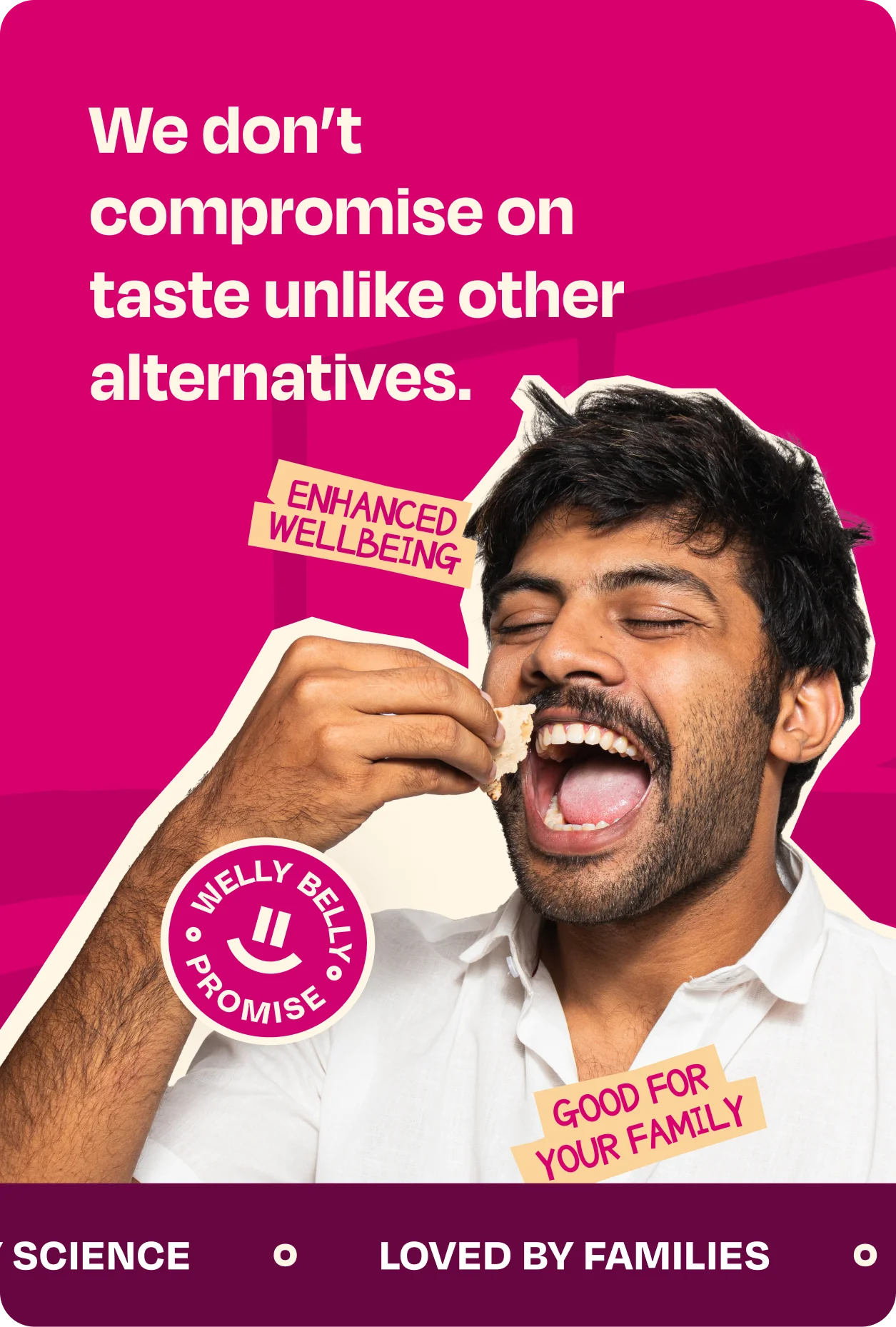
The smile starts in the logo and travels across the system, becoming a mark of assurance and even a wave of motion.
It reflects the joy of eating well, and the idea that everyone can share the same food, the same table, and the same joy.

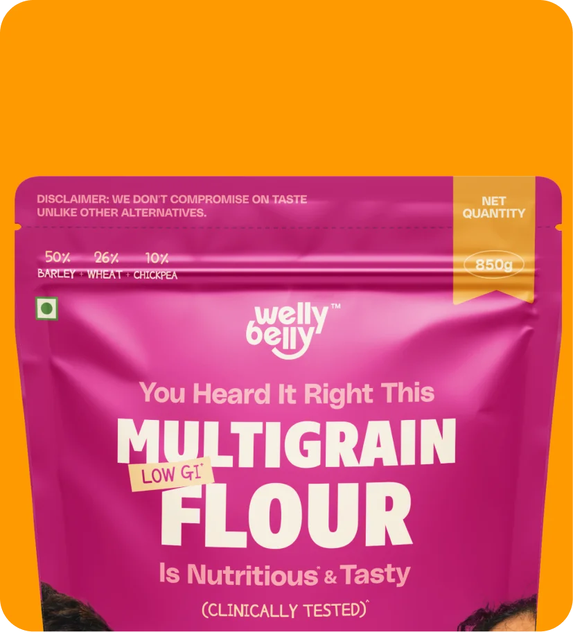
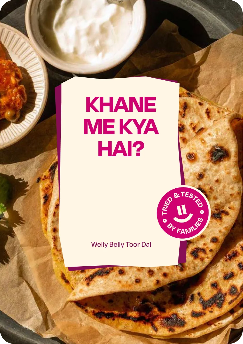
From “Khane mein kya hai?” to
“Khane mein actually kya hai?”
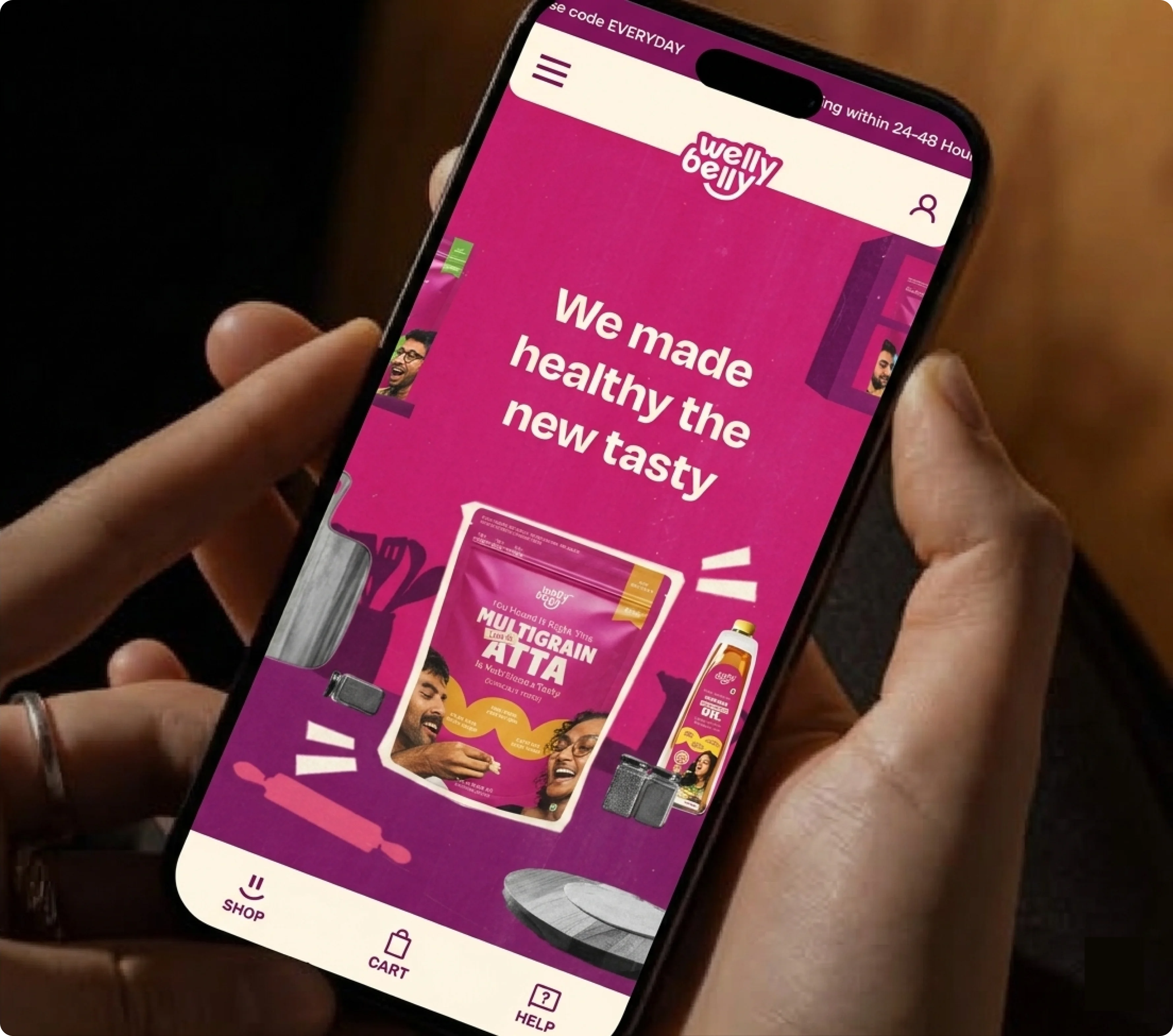
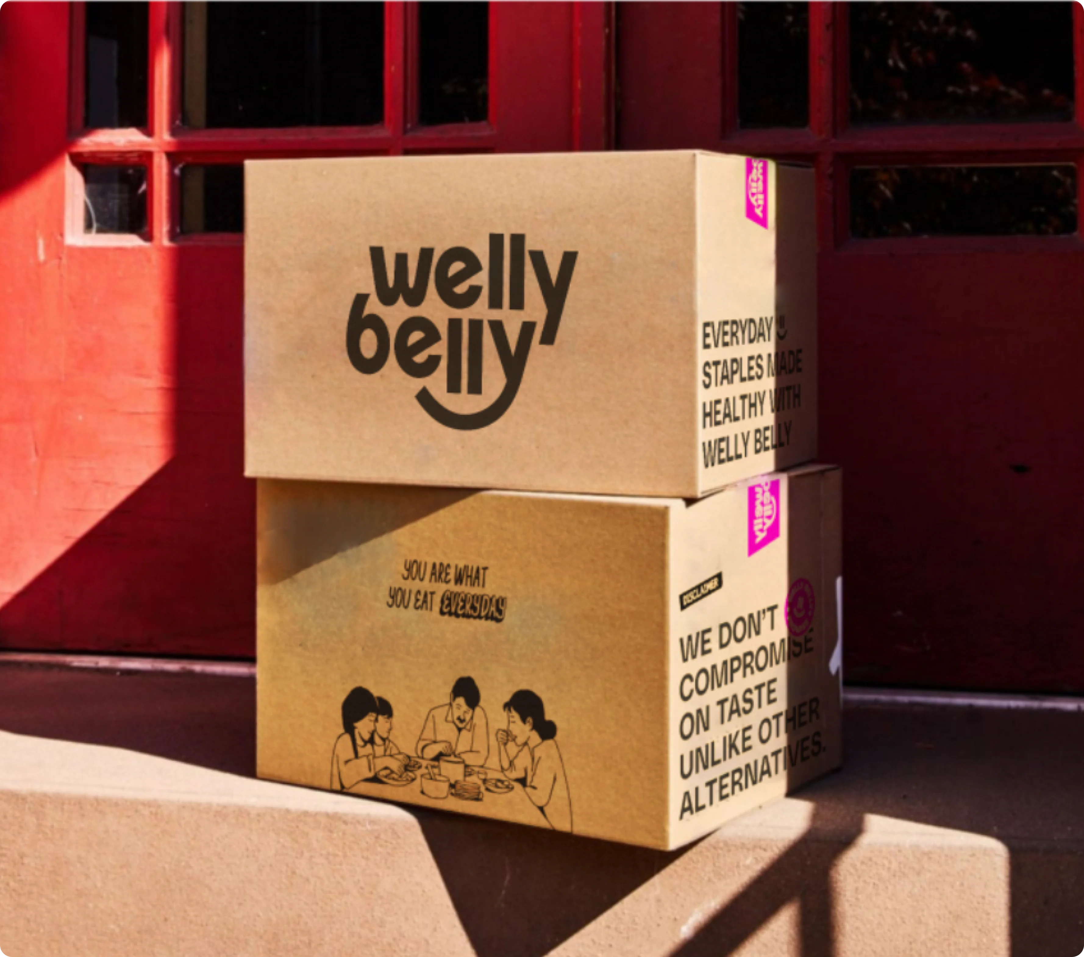
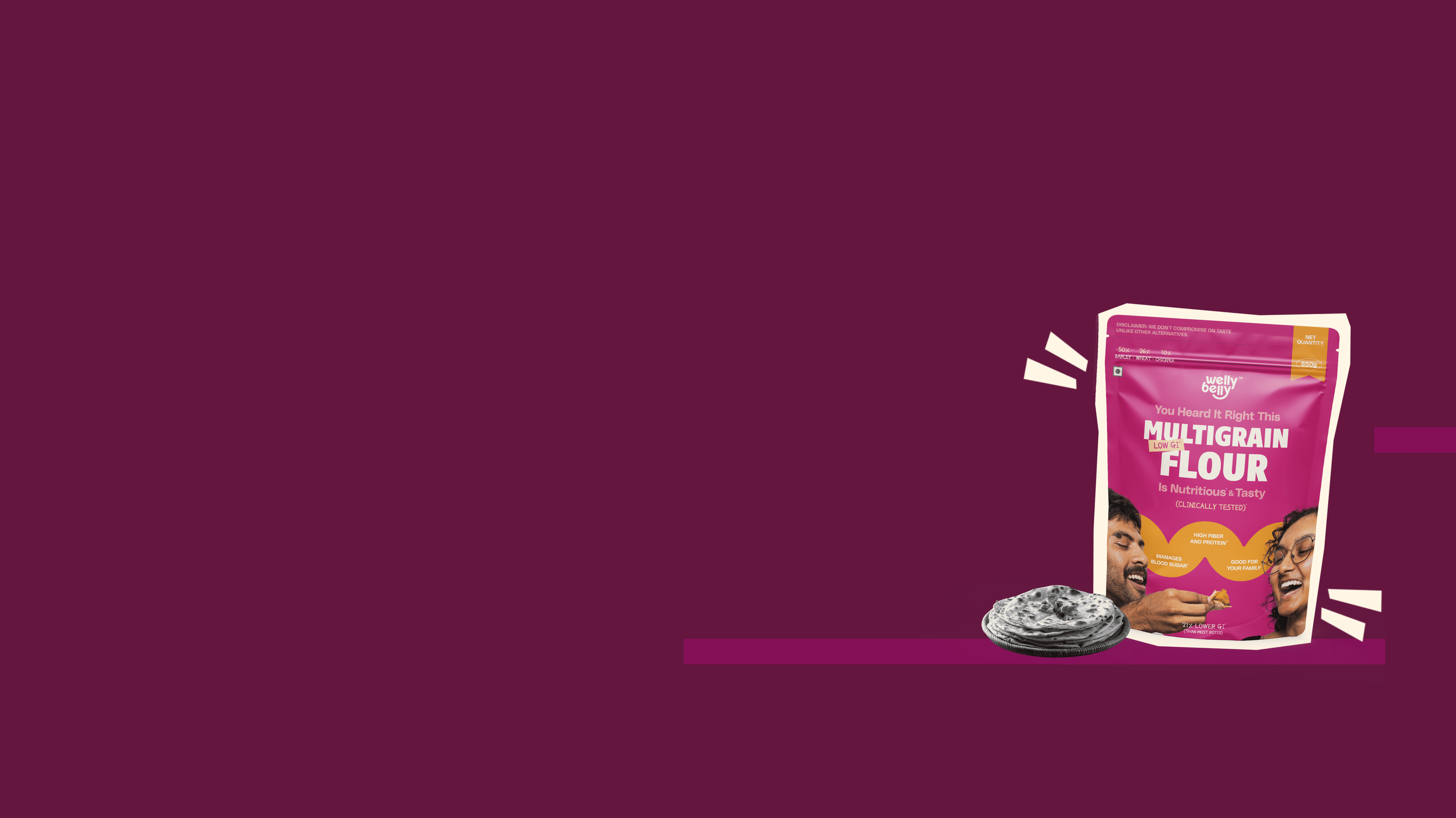
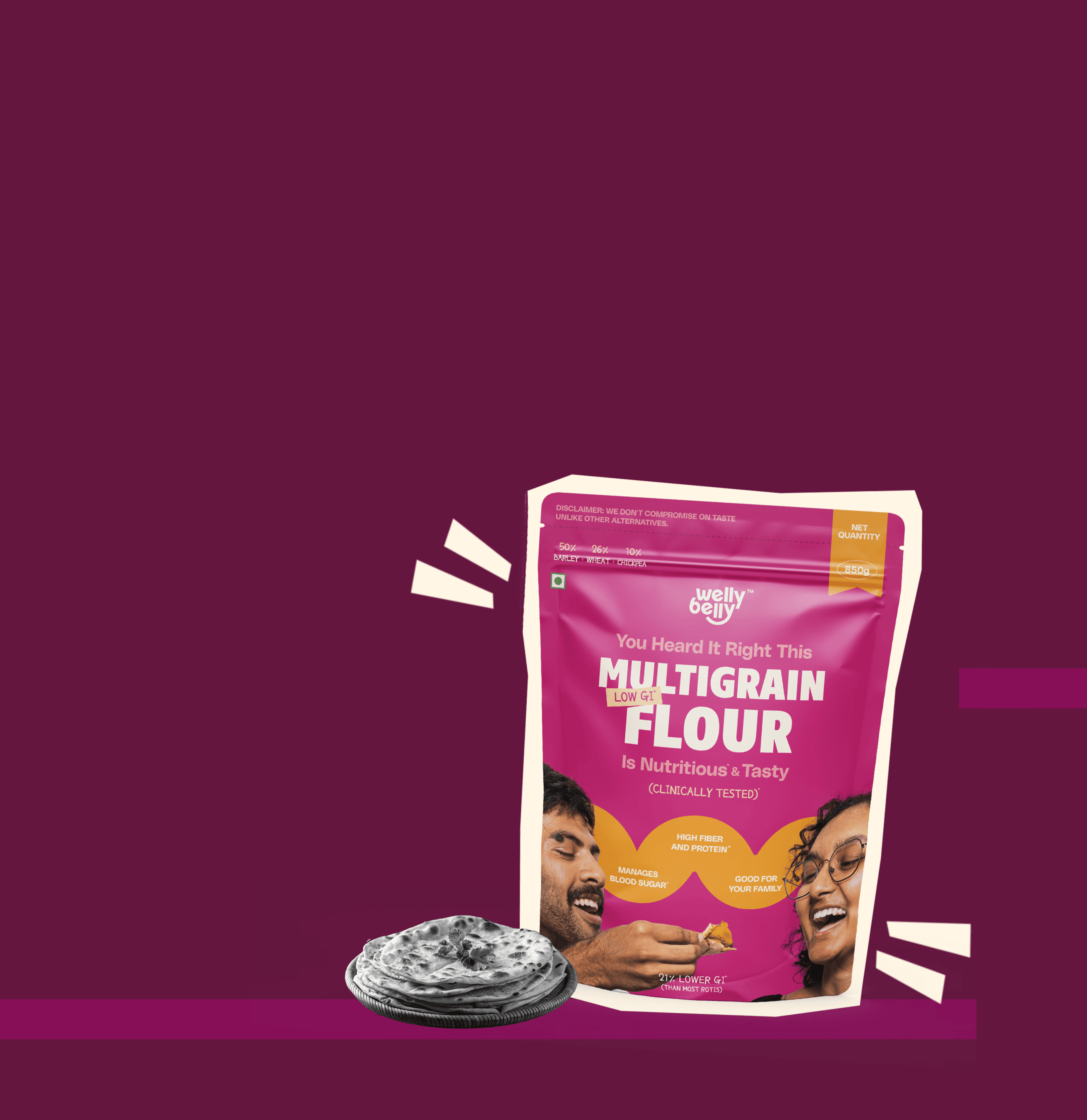
The packaging had to shift the conversation to pique customer interest. It was designed to draw attention, start conversations, and help people make sense of what they are choosing.
Packaging System
Dynamic Content
Regulatory Information
Core Brand Elements

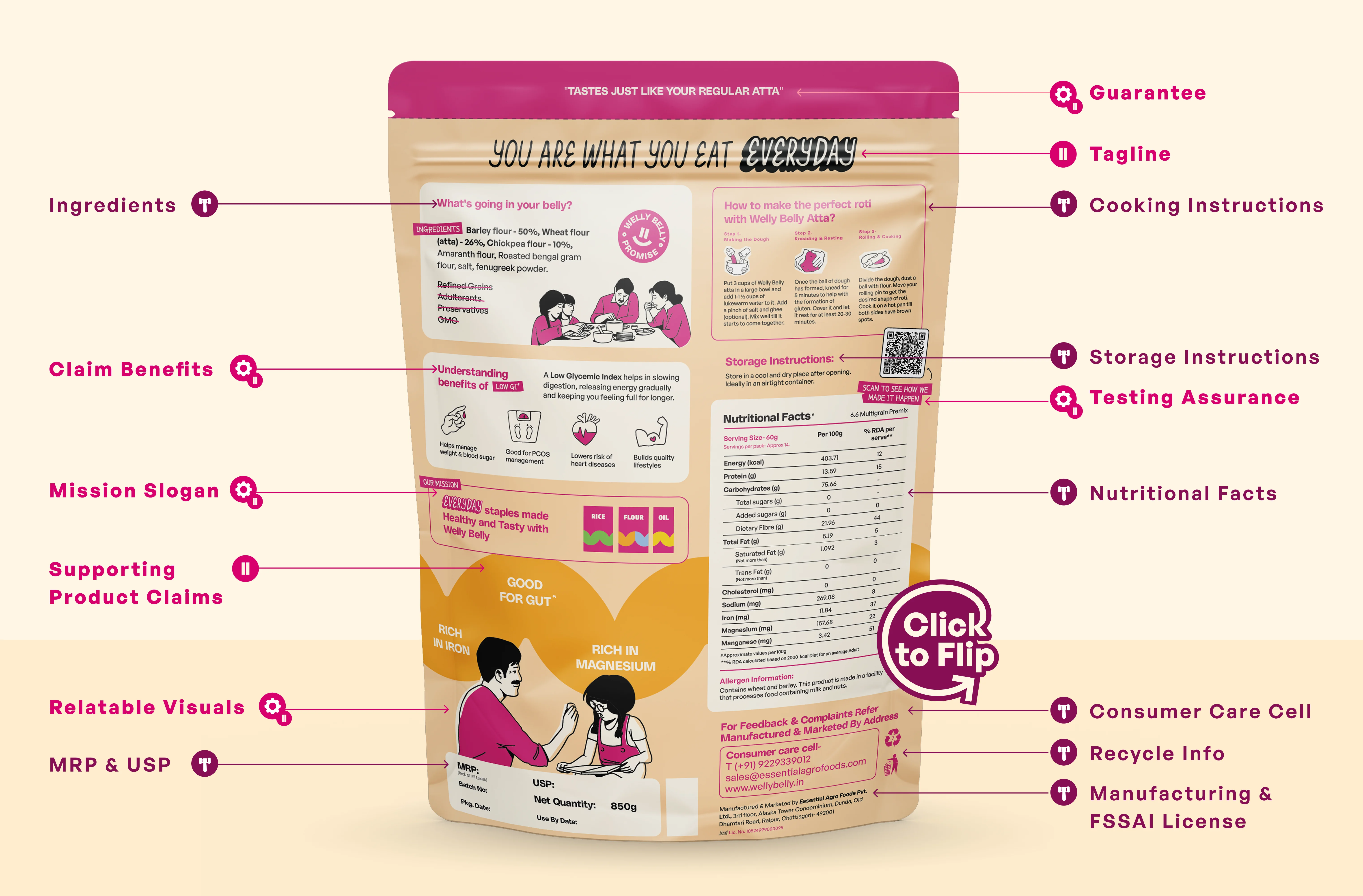
Beyond the pack